Struggling to make your designs look balanced? When colors compete instead of working together, it’s time to learn color theory and make every visual choice feel more deliberate.
The Psychology of Art and Colors from Alison helps you understand how shades influence emotion, meaning, and composition across cultures, creative fields, and personal projects.
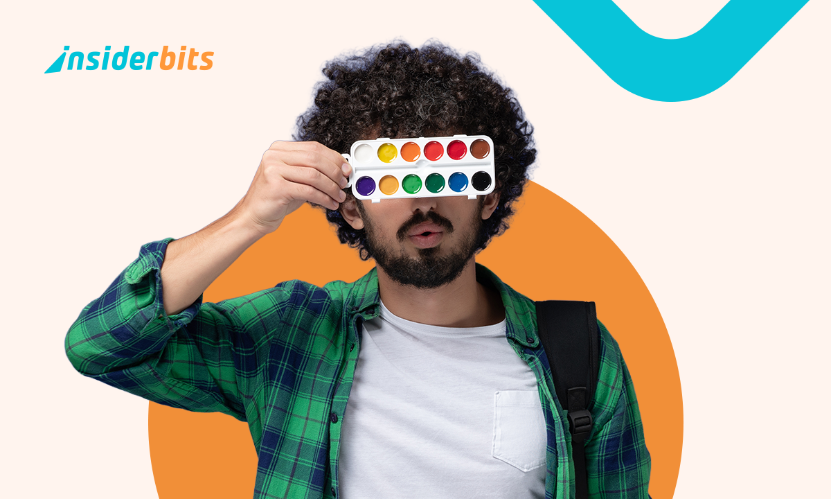
This guide by Insiderbits gives you practical ways to build visual harmony and make better creative decisions to experiment with color palettes and boost your design skills.
Correlato: The Best Free Photoshop Course With Certificate of 2025
Why you should learn color theory
The Psychology of Art and Colors course shows how color influences focus, emotion, and design. It teaches you to recognize why certain choices work better than others.
Through short lessons and real-life examples, this course links color use to visual storytelling, advertising, and digital media. You learn through observation instead of memorizing rules.
By the end, you learn color theory with a stronger sense of direction. It helps you create visuals that speak clearly and feel consistent across different contexts.

4.8/5
Discover how colors affect behavior
Color can change the pace of how people interact. Bright palettes energize while cooler ones slow things down and keep attention on small or quiet visual details.
Designers rely on this to support goals. Mood, tone, and even urgency are shaped before anyone reads a word. Color starts the conversation without explanation.
You will explore color harmony and design better visuals in this free online course. It teaches practical systems that align what you see with what you communicate.
Explore symbolism across cultures
Color meanings shift between cultures. White suggests purity in one place, mourning in another. These contrasts shape how visuals are read in different regions or contexts.
Tones tied to tradition influence packaging, branding, and digital design. One shade can offend, soothe, or inspire depending on background. Knowing this helps you communicate better.
Designing across borders becomes easier once you learn color theory. It gives you tools to spot where meanings change and adjust your message without changing your idea.
Learn why color psychology matters
Good design works when choices support your message. Color adds rhythm, structure, and emotion. Random palettes create noise, but consistent tones keep your ideas focused.
Marketing teams use color to support reactions. Calming apps use soft tones. Emergency alerts use contrast. Every decision influences what users notice and how they respond.
This is why designers learn color theory. When used with intention, color shapes trust, reaction, and recognition in ways that plain design elements cannot always achieve alone.

Step-by-step: what you’ll learn in the course
Questo Alison course breaks complex ideas into manageable lessons. You begin with the basics and move toward real design decisions supported by psychology, contrast, and visual strategy.
Each section builds on the last without repeating. You’ll develop visual awareness by watching examples, completing short tasks, and applying new tools in creative ways.
By the end, you’ll organize palettes better, communicate with more control, and recognize color as a practical design tool. Start learning color theory online today — free and interactive.
Step 1: decode the language of colors
You’ll start to learn color theory by seeing how designers use hue, shade, and temperature to direct focus, shape balance, and control emotional weight in design.
Colors form relationships. Warm tones advance, cool tones retreat. Neutrals offer balance. These shifts help you navigate visual content without distraction or unnecessary complexity.
Each lesson translates color concepts into patterns that work in practice. You’re not memorizing definitions. You’re training your eye to notice relationships in real environments and media.
4.8/5
Step 2: understand emotional color effects
Emotional response guides decision-making. In this step, you’ll study how color drives reaction, recognition, and rhythm across marketing, branding, media, and even public spaces.
This course helps you learn color theory through emotional application. Red doesn’t mean love everywhere. Green isn’t always calm. Context shapes how people feel about each tone.
Real examples show how designers align emotion and meaning without guesswork. Color is the first thing people see and the last thing they forget after leaving your design.
Step 3: get certified with real value
The final step gives you a downloadable certificate that reflects your progress. It is unlocked after completing each module and applying the techniques covered throughout the course.
You move through activities rather than memorization. Every exercise reinforces visual decision-making, helping you apply concepts and understand how color shapes design outcomes.
A certificate carries meaning when you learn color theory through guided practice. It confirms you applied the lessons, built real skills, and developed a foundation for creative projects.
Correlato: Project Management Course: From Beginner to Expert + Certificate!
Tips to combine shades and contrast like a pro
You don’t need a giant palette to make an impact. Choosing a few shades with intention is enough to guide the mood and keep things focused.
Contrast works best when you lead the eye. Place brighter colors near calm ones. Let empty space do part of the work instead of crowding every detail.
If you want stronger visuals, learn to combine colors that support what you’re saying. Each choice should help organize the message, not distract or compete with it.
Use psychology to balance palettes
When you learn color theory, you begin to see how every color speaks. You’ll pick shades that support meaning instead of just choosing what looks nice.
Color doesn’t exist in isolation. A pale blue next to deep orange feels balanced. Add too many bright tones and everything competes instead of working together.
Try building a palette with weight in mind. Use bold where you want attention, and balance it with softness that supports the rest of your visual story.
Create contrast with visual intent
Contrast isn’t just about brightness. Think about what needs to be seen first, and choose colors that make that decision easy for the people viewing your work.
By practicing contrast techniques, you’ll learn color theory in a practical way. Think saturation, scale, and distance and not just black versus white or light versus dark.
You don’t need to use heavy contrast everywhere. One focused element with space around it is more powerful than dozens of competing colors on the same screen.
Match colors to mood and message
Color helps people feel what you mean before they read a single word. Think carefully about the tone you want your project to carry from the start.
Some shades feel soft and warm. Others feel urgent or serious. Matching your palette to your message builds consistency that makes your work easier to absorb.
Once you learn color theory, you’ll stop guessing and start choosing with purpose. Color becomes a tool you use to shape reactions instead of leaving things to chance.

How to apply your skills
Now that you understand color’s impact, it’s time to put it to work. Theory becomes valuable when you turn it into something others can actually see.
Your first application doesn’t need to be big. Adjust one image, switch two colors, or revisit an old design. You’ll notice how much tone influences attention.
As you grow your visual instincts, choices become faster. Your eyes will catch imbalance early, and your designs will start working harder without needing more explanation or edits.
Design projects that speak louder
The moment you learn color theory, every creative decision becomes easier to explain. You won’t guess anymore. You’ll match color to message with stronger visual intention.
Think about where you want the viewer to pause. Choose colors that guide the eye naturally. You can set a rhythm just by adjusting tone and weight.
Instead of filling a layout, you’ll learn to direct it. Use saturation to lead. Let whitespace balance the noise. Build movement without adding extra shapes or distractions.
Bring color theory into your work
You already work with color every day. Your resume, your feed, your slide decks—they all send visual signals before anyone reads a single sentence.
By applying what you learn color theory teaches, you’ll start making better choices instinctively. That deep green might not fit your portfolio header after all.
Challenge yourself to improve familiar formats. Adjust one template, and you’ll begin refining more quickly, creating visual systems that feel intentional without needing more complexity.
Boost visuals across creative fields
Color affects far more than design. If you write e-books, manage events, shoot videos, or build product pages, your color decisions still influence how people engage.
Start paying attention to color across mediums. A thumbnail, a room, a spreadsheet—they all carry tone. Even subtle shifts can change how people process what they see.
Once you learn color theory and apply it across formats, your voice becomes more consistent. Color becomes part of how you communicate clearly, wherever your work shows up.
Correlato: Become an Interior Designer in Months: Best Free Certification Course
Turn every palette into possibility
The Psychology of Art and Colors course by Alison gives you practical tools and fresh insight. It’s a helpful step for anyone turning curiosity into creative visual direction.
This was a guide by Insiderbits designed to help you learn color theory in a more practical and personal way, so your next project speaks with stronger visual intent.
If you enjoy building new skills from home, keep browsing Insiderbits for more content about creative thinking, visual learning, and online courses that give you something real to apply.


